S&P 500’s 4% fall: How the US stock market has performed after big one day losses

The US stock market falls this week will have understandably unnerved investors the world over.
The S&P 500 fell 4.1 per cent on Monday, the largest one day fall since August 2011, when markets feared contagion from the European sovereign debt crisis.
Today, the concerns are less profound and actually stem from a bright economic backdrop. The US economy is growing at a pace that may create too much inflation, which in turn may necessitate rapid increases in interest rates.
It potentially marks the symbolic end to the era of ‘cheap money’ that has helped push up the price of investments. The time for widespread economic stimulus programmes deployed since the financial crisis of 2008 – from cheap borrowing to quantitative easing – may finally be over.
However, at moments of market turmoil it is wise to consider the longer view, bearing in mind that past performance is not a guide to the future – and always remembering that your capital is at risk when investing.
The first point to consider is that Monday’s 4.1 per cent decline was only the 33rd largest one-day fall in the past 30 years.
But what about the worst days?
The 10 worst days over the past 30 years
We looked at three decades of data and focused on the ten worst days.
The data, since 1988, showed that the S&P 500 had, on average, delivered average annual returns of 13.6 per cent in the five years following the ten worst days.
Of those ten days (shown in the table below), the strongest rebound was a return of 164 per cent, or an annualised 21 per cent, in the five years after a 6.7 per cent fall for the S&P on 20 November 2008. That day landed during one of the bleakest episodes of the global financial crisis.
Investors may have been surprised that an investment of $10,000 at the start of that turbulent day would have grown to $26,400 within five years, before charges.
Ten worst one-day falls for the S&P 500

The pattern is repeated on many of the ten worst days, which largely fell during the financial crisis. The most severe was a 9.03 per cent fall on 15 October 2008. This was followed by a five-year return of 109 per cent, or an annual equivalent of 15.9 per cent.
In all, six of the ten worst days over the 30 years fell during a short four-month spell, from September to December 2008.
In our 30-year data set, four other years feature: 1989, 1997, 1998 and 2011. The 6.9 per cent sell-off on 27 October 1997 was caused by an economic crisis in Asia. The 31 August 1998 crash, which saw a similar-sized decline, came shortly after a debt default by Russia which dealt an equal blow to global market confidence. The 1989 tumble was called a mini-Black Friday, falling on the 13 October, and came ahead of the early 1990s recession.
More investing views and ideas:
- What has driven stock market returns for each market?
- Six charts of the month
- How I scored in an investment IQ test
After these falls, the returns in the following years were less impressive, despite an initial rally in most cases. For example, five years after the 1997 crash, the S&P had only returned 9.6 per cent or a paltry 1.85 per cent a year.
Five years after the 1998 plunge, shares had returned a marginally better total return of 13%. Ten years on from the event, however, the returns were 22 per cent and 28 per cent, or annualised rates of 4.1 per cent and 5.1 per cent.
Five years after the worst sell-off of the eurozone debt crisis, in August 2011, the total return was 117 per cent.
The calculations were based on 30 years of “total return” Bloomberg data, which includes the contribution of dividend income payments to returns.
Was the US market due a correction?
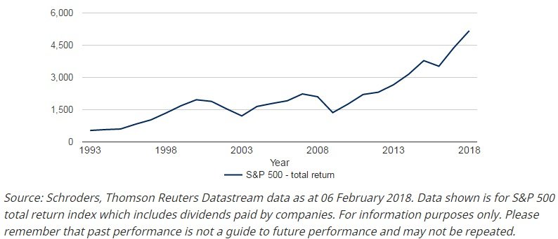
The data underlines the strength of equities over the long-term. But the scattering of dates, notably the lack of sharp stock market falls since 2011, also reflects the relative calm investors have enjoyed in recent years and particularly in the past 18 months.
With rapid price gains has come a fuller valuation for the US stock market – and higher valuations increase the chances of a correction in equity prices. When measured by the cyclically-adjusted price to earnings multiple or “CAPE”, the US had looked expensive against its historic norm.
CAPE is a more applied version of the price to earnings (p/e) ratio. It compares the price with average earnings over the past 10 years, with those profits adjusted for inflation. This smooths out short-term fluctuations in earnings. Historically, lower returns have followed when CAPE has been high and higher returns have come after low valuations.
Before the US market’s recent slide, it was trading on a CAPE of 32 compared to a 15-year average of 25, based on the MSCI US index. That would imply US shares were 22% more expensive than usual.
On the more standard p/e ratio, the US stockmarket was at 25.7 compared to a 15-year average of 18.
We have previously published analysis that shows valuations for some of the world’s major markets:How to value stock markets going into 2018.
Some market commentators have blamed the recent falls on data published last Friday that showed wages growing at 2.9 per cent, hence the heightened concern about inflation – and the possibility of more rapid rate rises. However, this should be considered in the wider context of valuation.
Shares had, perhaps, run too far ahead and a correction was needed. But optimists highlight plus points: economies around the world are enjoying rare synchronised growth while tax cuts in the US may further brighten the outlook for companies.
Either way, investors should always consider the long-term view.
25 years of total returns on the S&P 500

Important Information: The views and opinions contained herein are those of Andrew Oxlade, Head of Editorial Content, Schroders, and may not necessarily represent views expressed or reflected in other Schroders communications, strategies or funds. This material is intended to be for information purposes only and is not intended as promotional material in any respect. The material is not intended as an offer or solicitation for the purchase or sale of any financial instrument. The material is not intended to provide and should not be relied on for accounting, legal or tax advice, or investment recommendations. Reliance should not be placed on the views and information in this document when taking individual investment and/or strategic decisions. Past performance is not a guide to future performance and may not be repeated. The value of investments and the income from them may go down as well as up and investors may not get back the amounts originally invested. All investments involve risks including the risk of possible loss of principal. Information herein is believed to be reliable but Schroders does not warrant its completeness or accuracy. Reliance should not be placed on the views and information in this document when taking individual investment and/or strategic decisions. Some information quoted was obtained from external sources we consider to be reliable. No responsibility can be accepted for errors of fact obtained from third parties, and this data may change with market conditions. This does not exclude any duty or liability that Schroders has to its customers under any regulatory system. MSCI: Third party data is owned or licensed by the data provider and may not be reproduced or extracted and used for any other purposes without the data provider’s consent. Third party data is provided without any warranties of any kind. The data provider and issuer of the document shall have no liability in connection with the third party data. The Prospectus and/or schroders.com contains additional disclaimers which apply to third party data. Regions/sectors shown for illustrative purposes only and should not be viewed as a recommendation to buy/sell. For help in understanding any terms used, please visit schroders.com/en/insights/invest-iq/investiq/education-hub/glossary/. Issued in February 2018 by Schroder Investment Management Limited, 31 Gresham Street, London EC2V 7QA. Registration No 1893220 England. Authorised and regulated by the Financial Conduct Authority