Tokyo 2020 logo fiasco provides lesson in due diligence for sports marketers

Nowhere is the power of a logo more evident than in sport.
It’s the thing that pulls together everything you represent: banner, flag, symbol or icon. An event or tournament logo also needs to represent and reflect the equity, value and identity of a competition or event.
Read more: Tokyo to stage the 2020 Olympic games
Which is why it’s so positive to see sporting rightsholders starting to think so smartly about their logo design.
Take the MLS, whose recent logo redesign was a genuine creative triumph. By smartly incorporating the identifiable colours of each of its member clubs, the rightsholder carefully acknowledged what really matters to their passionately devoted fans: their individual teams.
It’s a move that bears more than a nodding resemblance to Coca-Cola’s Football League Club Colours creative from back in 2004. In this instance, to allay fears of the sponsorship being an unwieldy badging exercise, Coca-Cola deliberately – and with careful permission – imbued that which is most sacred to them (the iconic Coca-Cola logo) with that which was most sacred to the fans (their club’s colours). 72 times.
![]()
The London 2012 logo – derided at first – became iconic at the event (Source: Getty)
This modular approach to an event logo was something seen on the largest scale at London 2012. Although London’s logo was roundly criticised on its launch in 2007, lacking distinguishable landmarks or cues, it could be argued that the fresh and flexible design reflected the city and its approach of a ‘modern Olympics’ better than many initially imagined. In many ways the blueprint for the MLS design, logo customisation in brand partner colourways – a hugely appealing prospect for the London 2012 sponsors – was a step-change in Olympic marketing terms.
Read more: Beijing beats Almaty bid to host 2022 Winter Olympics – despite lack of snow
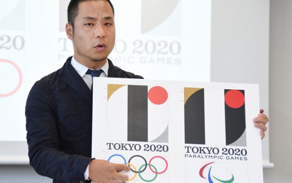
With so many potent learnings, it’s fair to say that Tokyo 2020’s decision last week to scrap its event logo was relatively shocking.
At best, designer Kenjiro Sano was unlucky. I mean, how might he have known about his logo’s resemblance to that of a theatre in Belgium, right?
At worst, it’s rather grubbier than that – particularly since this is not the first time Sano’s output has had the whiff of healthy borrowing about it (even from his own work).
Regardless, the big question is how Tokyo 2020 let it get this far: the apparent free rein given to Sano offering too much room for creative introspection and too little for commercial considerations. Undue diligence of this scale is not acceptable in today’s smaller world, with the always-on, socially-enabled transparency of the media no longer providing an excuse for negligence – whether of procedural best practice or the letter of the law.
Let’s hope there’s a more intelligent design behind the scenes that will help tell the Tokyo Story. Otherwise, it’s back to the drawing board.