Five charts that sum up the latest government borrowing data

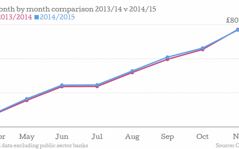
If this is austerity, it’s austerity light. The latest public sector finance figures from the Office for National Statistics (ONS) reveal a not-so-huge drop in borrowing for the April to November period: the iron scissors of George Osborne have trimmed half a billion from the bill compared to last year.
That doesn’t look like huge savings.
At that rate it would take over 75 years to wither borrowing away to nothing, although last year’s borrowing was the lowest for a while.

For November alone the figures were rosier. The government required £14.1bn to shore up spending, a decrease of £1.6bn compared to November 2013. As the ONS is quick to point out, monthly data is too volatile to be taken in isolation. Sorry George.
The bigger figure that still excites interest is the national debt pile, which now stands at £1,45tn, or 79.5 per cent of GDP an increase of £89.7bn in the last year:

Of course, if the economy grows fast enough, net debt can go up while decreasing as a percentage of GDP. That isn't really happening either. The difference bailing the banks out made is a large one.

Why, with the economy growing at the fastest rate in the G7 and wages (above inflation) finally joining unemployment (six per cent) in heading in the right direction, are borrowing figures not turing around as quickly? One of the problems is the slow wage growth. Salaries have only recently nosed ahead of inflation and many jobs were being created in low paying sectors. That means smaller tax receipts.
