| Updated:
Ukip party conference 2014: Three reasons Ukip might have the best brand in politics

After Ed Miliband’s much-maligned slip-ups, this weekend it’s Nigel Farage’s turn to show the world he’s a man of the people, at the Ukip party conference.
Farage may be mocked by some – but during his tenure as its leader, he has transformed it from a party on the margins of the political system to one which, in some polls, is bigger than the Liberal Democrats. bigger than the Liberal Democrats.
Does Ukip have what it takes to become the biggest brand in politics? Let’s compare it with its rivals…
1. Name
Tories first: according to the dictionary, the word “Conservative” means ”reluctance to accept change”.
“Labour”, by contrast, means “work” – hard work, to toil at something. While this is a value that made Britain great, these days it seems a little old-fashioned.
“Liberal“,of course, means open to new ideas, but also means eschewing tradition. We are a nation of fine history, why would we wish to forget that? Plus, to many, liberal means somewhere in the middle and very wishy washy and limp.
By contrast, Ukip works for the text savvy, celeb-obsessed generation: J-Lo, K-Stew, Ukip. It’s an abbreviation which means nothing but sounds upbeat yet decisive. It doesn’t convey political leaning and is therefore open to interpretation.
2. Logo

(Source: Getty)
It starts to get really interesting when we look at their logos.
The Conservatives have changed a lot in recent years, moving from a flaming torch which was seen as aggressive Thatcherism to a tree. interestingly, since Ukip started making ground, it seems to have used the Union Jack version of the tree more prominently. Unfortunately it has lost a lot of meaning: panic branding is never good.
Labour is sticking with its trusty red rose, and the liberals do well again with a bird in flight, which stands for freedom and peace.
But at a time of immigration issues, financial strain and terrorism, the downtrodden man often comes out of the trenches fighting, not waving a white flag
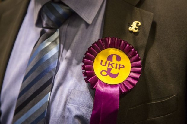
And the Ukip logo? A purple pound sign on a yellow circle: it looks like a money off sticker in Asda. But then maybe that’s the point. As Aldi and Lidl destroy Tesco by providing real value for money for the clever shopper, so Ukip provides assurances of financial stability.
The pound is front and centre: “it means we’re proud to be British – we might be part of Europe, but we’re not really”. “We’re an island, we stand alone, we’re big and bold and on the world stage. We’re Britain”. It’s not a sophisticated logo (and from a design perspective it’s pretty awful) – but it speaks to the audience and it tells them what they need to know, without snobbery, violence or prejudice.
3. Leaders

(Souce: Getty)
Starting again with the Conservatives, there’s David Cameron, a posh bloke who tries to be a bit normal by going jogging and holidaying in Cornwall, but we all know he’s not one of us.
Ed Miliband, another posh guy we can’t associate with – and to make matters worse he can’t even eat a bacon sarnie without looking like he’d rather have Eggs Benedict. Nick Clegg – nice enough, but he’s ineffectual and changes sides faster than Frank Lampard.
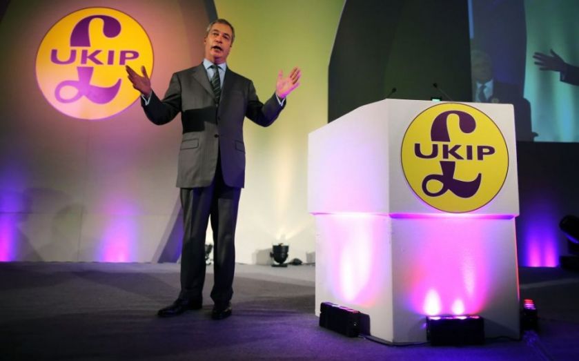
Nigel Farage on the other hand – he’s a bloke, salt of the earth, happier in the pub with a bitter and a cigarette. He’s the kind of guy we know, we trust him, he’s decent. He’s one of us.
In the rise of Ukip there is much to do with the two main parties occupying the middle ground, of our disillusionment of expenses scandals, corruption and ‘them all being the same’.
To the disillusioned, Ukip brings different thinking, different politics. For many of those living outside the bubble of London, Ukip represents the lost strength of Britain, of our once great nation, of being proud to be an island nation once again.