This alternative Tube map shows you the travel time from every station on the London Underground

When reinventing the Tube map, why settle for half measures?
A new version designed by developer Peter Trotman throws out Harry Beck’s iconic 1931 design entirely to create an interactive map based not on geography but travel times.
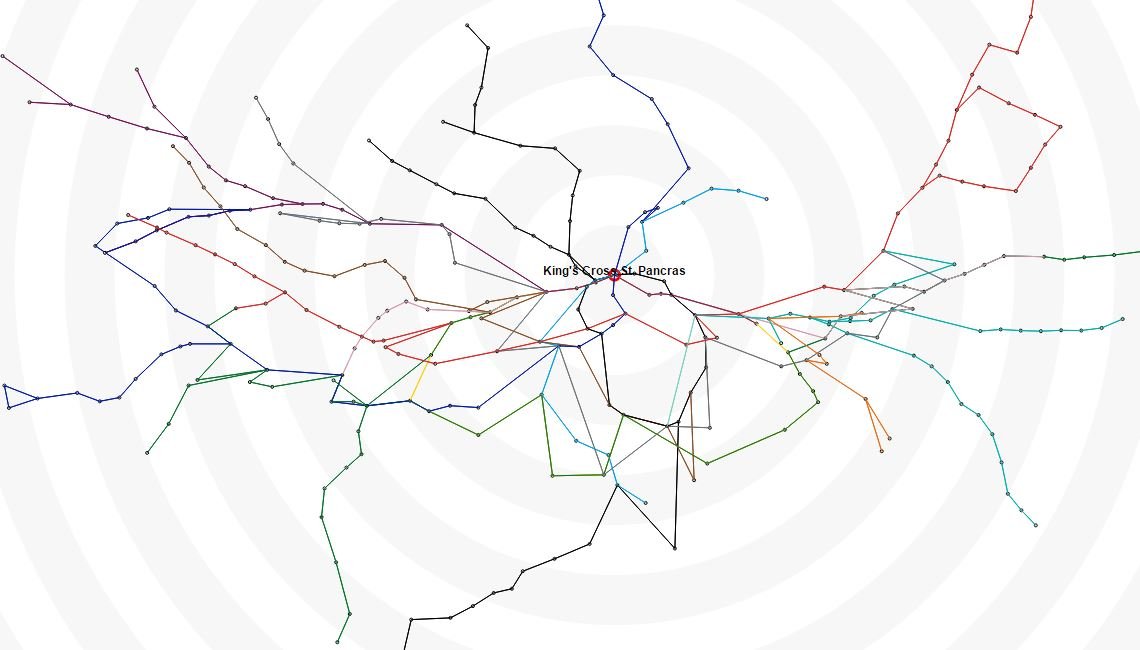
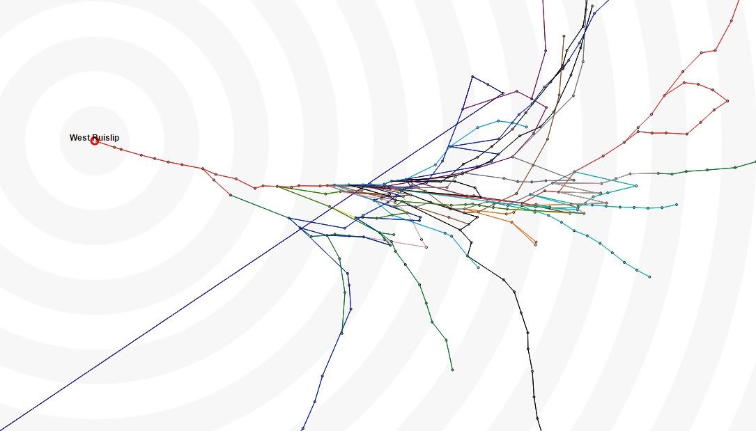
The map distorts based on the time it takes to travel from the station you’re starting from.
So if you’re heading out from well-connected King’s Cross, the map won’t look entirely dissimilar to the London Tube map you know (and love?).

Commuters planning a journey from, say, West Ruislip, however, will discover a map that bears no resemblance to either geography or Beck’s map (just look at what happens to the Piccadilly line!).

This solves one of the grips many have with Transport for London’s official map: the way it misrepresents distances between stations. Journeys that appear only a few minutes long on the map can turn out to be several kilometres long, an element of surprise that no one needs on their rush hour commute.
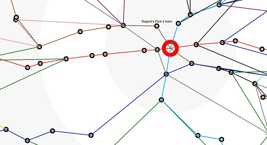
You double-click on a station, or click on a station from the sidebar and it becomes the focal point on the map, shifting all other destinations around based on how long they will take to reach from your point of origin, and giving you an estimated travel time in minutes.
Read more: TfL secretly make a geographically accurate Tube map and it’s strangely hypnotising
Trotman explains on his blog that he created the map as a visualisation tool rather than a route planner, but that the times are “reasonably accurate”:
“The time taken is calculated using average journey times from TfL with an additional 5 minutes for each line change,” he writes.