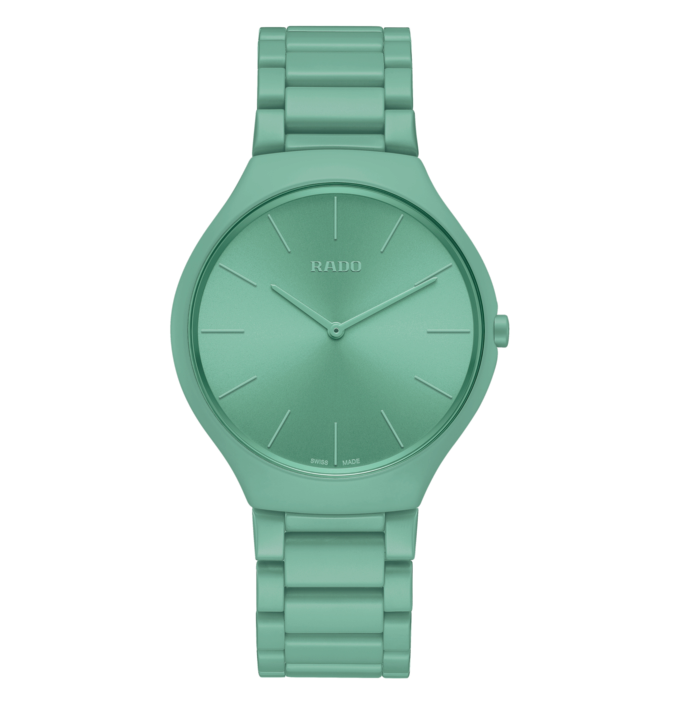
Let there be colour: Rado’s range of watches made to Le Corbusier’s famous colour system are deliciously on trend

Does your house have chic grey walls? Complementary saffron accents? Maybe a statement colour chair and tiled section? Chances are all of these shades have featured in Le Corbusier’s Architectural Polychromy.
Because, as well as designing buildings, planning towns and being an all-round polymath, Le Corbusier developed a theory of colour. Corbu, as he was known to his friends, believed that choosing the right shades was integral to spatial effects.
Comprising 63 shades – the first and more nuanced palette of 43 from 1931 and a second bold colour board of 20 from 1959 – his selections were conceived as a guide to combining complementary colours. Organised like a keyboard, you slid a cardboard cut out along the colour scales to reveal the harmonious shades.
His theory comprised three basic concepts: you use natural colours to create atmosphere, bold hues are used for contrast, then slightly washed versions of those bold shades to subtly alter the space.
You may be wondering why you’re getting a lecture on mid-century colour use in a watch column. Well that’s because, for the first time, Les Couleurs Suisse, the company that controls who’s allowed to use the colours from Le Corbusier’s Architectural Polychromy has allowed Rado to choose nine shades and render them in ceramic for its Thinline range, the first-ever commercial use of these exact shades.
The collection is a wonderful celebration of colour; a veritable horological pick-and-mix
The collection is a wonderful celebration of colour; a veritable horological pick-and-mix. The more delicate hues – washed-out siennas, dusky pinks and muted minks – are from the 1931 palette, while the remaining contrast brights are from the additions that came in 1959. Getting the exact match on these shades was a headache that even Rado, with all its experience in colouring ceramic, found a little daunting.
“We had to match Le Corbusier’s original colours exactly,” explained CEO Matthais Breschan.
Rado was the first to seek permission to emulate Corbu’s pigments but it’s not the only watch brand seeking inspiration from his colour scheme. Last year, Oris launched an 80th anniversary edition of its Big Crown Pointer Date in a delicious shade of sludgy mint green, also inspired by the Swiss maestro. There’s also more than a hint of mid-century about Montblanc’s Heritage Spirit Pulsograph. This timepiece has everyone’s pulses racing not least because of its dusky salmon dial, a shade that was echoed a couple of months later in Patek Philippe’s 5270P.
Writing in a 1931 swatch book Corbu created for Swiss wallpaper brand Salubra, he said “Each of us, according to his own psychology, is controlled by one or more dominant colours”. Now you can make sure the colour on your wrist matches the one inside your head.
Laura McCreddie-Doak is one of the country’s foremost experts on women’s watches and jewellery