| Updated:
The new map tool that has data geeks crying with joy

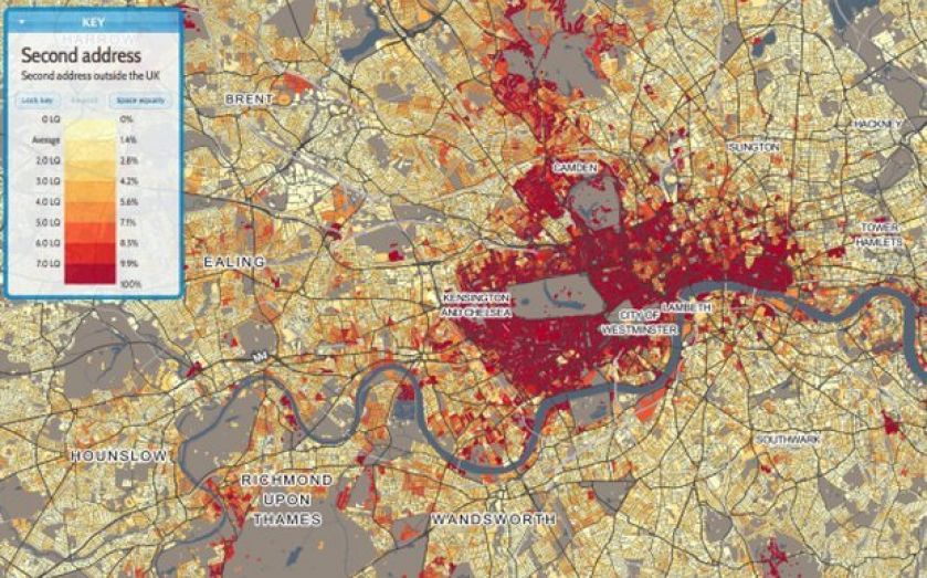
Two University College London (UCL) researchers have set up a paradise for data-lovers, giving people the ability to map a huge range of social and economic indicators onto their own area, or any in England and Wales.
The site looks almost effortless, and is far superior to any similar offerings from government databases.
It launched just a week ago, and if you follow a lot of economists, journalists or others who use data regularly in their work on Twitter, we suspect you will get used to seeing maps of this sort posted regularly.
UCL lecturer James Cheshire and researcher Oliver O’Brien are behind the project, and continually tweet out some of the fascinating maps. And the great thing about the application is that it’s incredibly simple to use yourself. Take a look. The map URLs also auto-update, a seemingly minor feature but one that makes it much easier to share what you're looking at or jump to compare the same data series for another postcode.

The share of households without central heating in Preston (Source: Datashine)
The project currently maps 2011 census data and Office for National Statistics data, but is part of the wider “Big Open Data: Mining and Synthesis” (BODMAS) project, which was given a grant from the Economic and Social Research Council (ESRC) last summer. According to Cheshire's own blog, the map feature is just the start.

How Newcastle and Gateshead's health breaks down (Source: Datashine)
This sort of project shows just how accessible you can make reams of seemingly dry data. Effectively, DataShine is to the Office of National Statistics what CityMapper is to Transport for London – after endless struggles with the official institution, a relatively small outside operation has managed to display the information in a much more useful way.

The proportion of Muslims living in different parts of Leeds and Bradford (Source: Datashine)