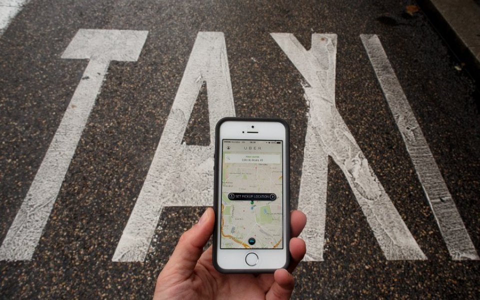
Ride hailing app Uber has changed its logo and branding

Controversial ride hailing app Uber has completely changed its logo and branding, after its chief executive said the firm's old look started to remind him of a hairstyle that hadn't been in fashion since the 1990s.
Travis Kalanick, chief executive and co-founder of Uber, said that the re-design reflects how much Uber has changed since it started as a black car service for 100 friends in San Francisco.
"Uber started out as everyone's private driver. Today we aspire to make transportation as reliable as running water, everywhere and for everyone," Travis Kalanick, chief executive and co-founder, wrote in a blogpost.
"Our new brand reflects that reality by working to celebrate the cities that Uber serves. We're excited to share it with you."
The app now has two separate icons for riders and drivers, which have the bit at the centre, and then the local colours and patterns in the background.
The logotype is "more grounded and elevated", a feature that will help customers recognise the Uber logo from afar, and when it's in small places.
The company replaced its original red magnet logo with the black badge most people will be familiar with today four years ago.